
I designed the MVP for the CareVicinity mobile app within a four week timeframe. The app will service our existing providers, allowing them to manage their jobs and send messages efficiently. With a March 2026 launch date, the app will be marketed towards our 3,600+ registered providers.
Role
Solo Product Designer
platform
IOS & Android app
Timeframe
December 2025 (four weeks)
Overview
An online platform provider for assisted care services
CareVicinity is a marketplace platform that connects support workers with elderly individuals and veterans who need in-home care services. The platform empowers independent contractors to build their own care businesses by allowing them to choose their clients, set their own rates, and manage their schedules while CareVicinity handles payments and administrative tasks.
The Problem
Support workers don't have time for admin
CareVicinity providers are predominantly sole traders performing shift work, traveling from client to client with little time to spare in between. They don't have the luxury of sitting down at a computer to log shifts, respond to messages, or check for new job opportunities. Their primary focus is maintaining relationships with clients and providing quality care - not administrative tasks.
On the business side, we found providers missing time-sensitive messages from clients and coordinators, overlooking new job postings, and not maximising their schedule efficiently. Unfullfilled jobs were rising despite us having the numbers to fill them, it was just a matter of communication and engaging providers with the platform effectively.
Opportunity
Manage jobs on the go, with ease
Develop a mobile app that simplifies shift logging and invoice tracking. A native mobile app unlocks more ways to communicate - like push notifications for time-sensitive messages and alerts, straight to providers' phones.
Analytics showed mobile usage significantly outpaced desktop among support workers. On peak days, 433 providers logged in via mobile compared to 293 on desktop - a 48% difference. This pattern held on typical weekdays, averaging 390 mobile users versus 280 desktop users.
user interviews
Uncovering provider frustrations
During user interviews I carried out over several months prior, I already had an idea of what providers were looking for in a mobile app. It was evident many providers were tracking their hours in a notebook or excel spreadsheet. Many were put off learning a new system, and always defaulted to what they knew best - pen and paper. It was imperative that the app be user-friendly and an improvement on the current web platform where possible.
Some insights from providers:
"I'm missing notifications for invitations to apply for jobs until I look days later.. by then they've already found someone and I'm wasting my time"
"The shift logging form on the web is tricky at first, but now I've gotten the hang of it. I do wait until the end of the week to log my shifts in one go."
"The clients can get annoyed when I don't respond quickly in the inbox, but I can't be checking the webpage every hour just incase. It's unrealistic."
"I prefer using my notebook or Google calendar on my phone to schedule my shifts. I like being able to glance down and view my whole week."
A common theme emerging was time-sensitive messages being missed, as users were typically only logging in a couple of times per week to log shifts and check invoices. They would miss the message from a coordinator in their inbox asking if they could pick up an extra shift, or the invitation to apply to a new job.
Final designs
Stripping back scope to must-haves
User research revealed clear core journeys providers were taking through the platform, which I validated by analyzing competitor marketplaces like Airtasker to understand established patterns and user expectations.
As my first solo mobile app project, I invested time upfront studying iOS and Android design guidelines to ensure the app would feel native to each platform and meet accessibility standards. This foundation proved essential for making informed decisions quickly.
The four-week design deadline from senior stakeholders meant we needed a laser focus on what truly mattered. I worked closely with our Tech Lead to define a lean feature set, evaluating each requirement against the question: "Does this solve a critical provider need for MVP?" This collaborative scoping process helped us strip away nice-to-haves and build only what was essential to get providers scheduling and managing shifts effectively.
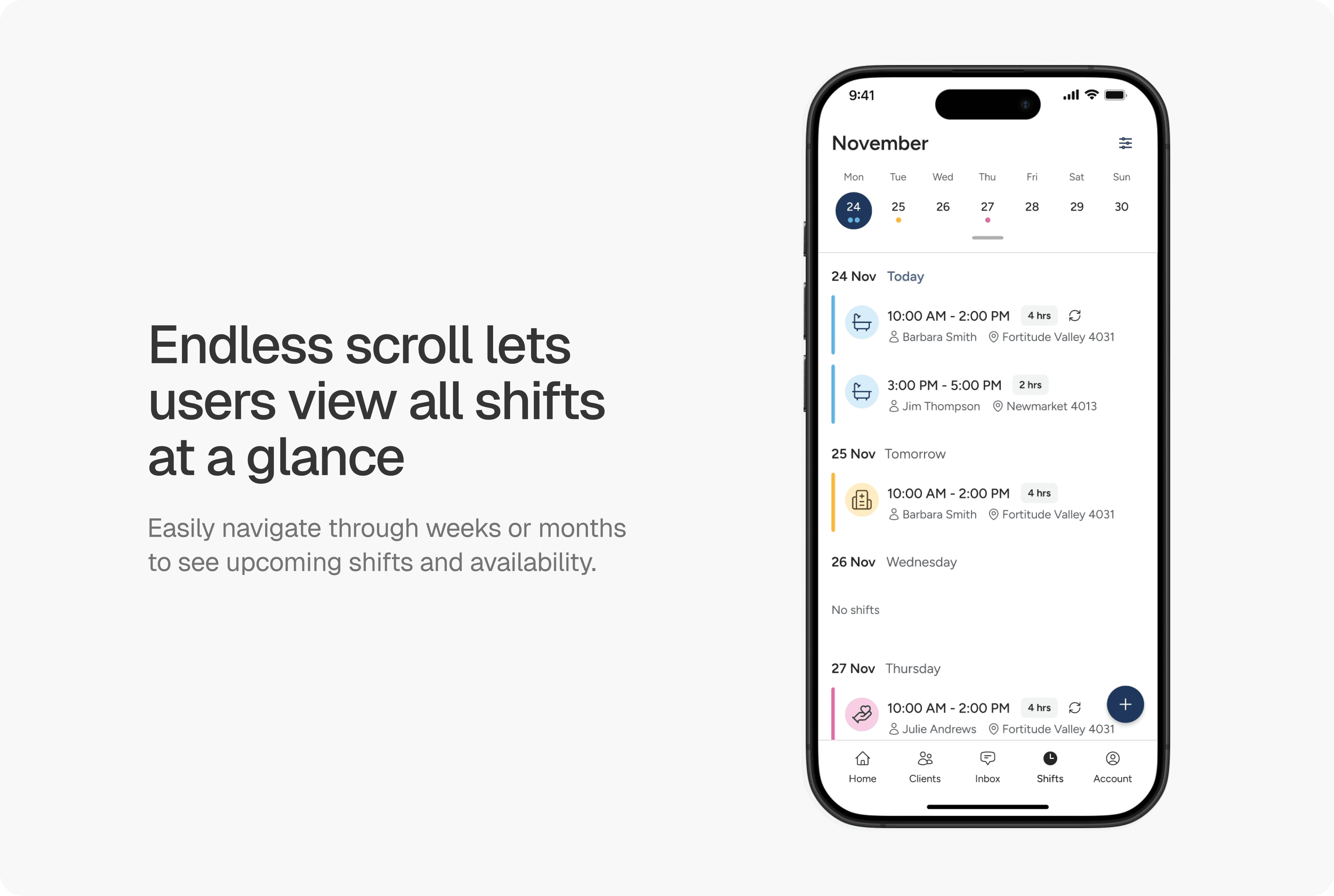
Shifts page
The shifts page was designed to be easily scannable, allowing providers to identify key details about each shift and see any scheduling conflicts or gaps. Each shift card surfaces essential job details without overwhelming users with unnecessary data. Providers can endlessly scroll to view upcoming weeks and months.
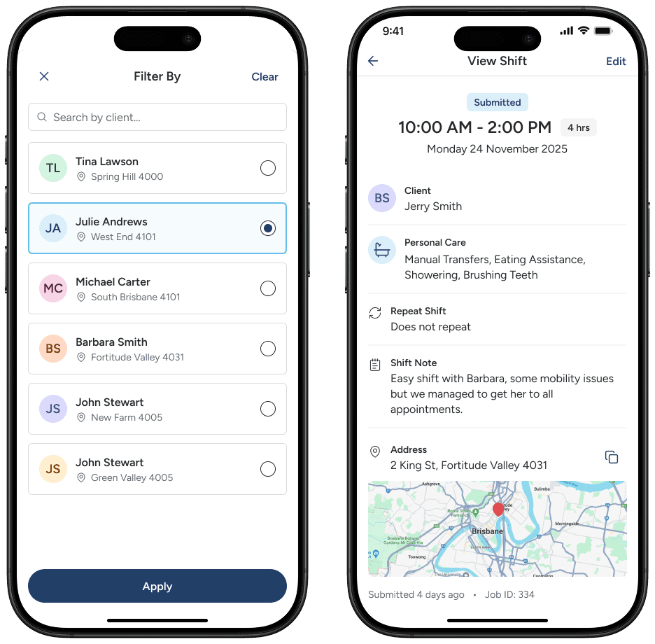
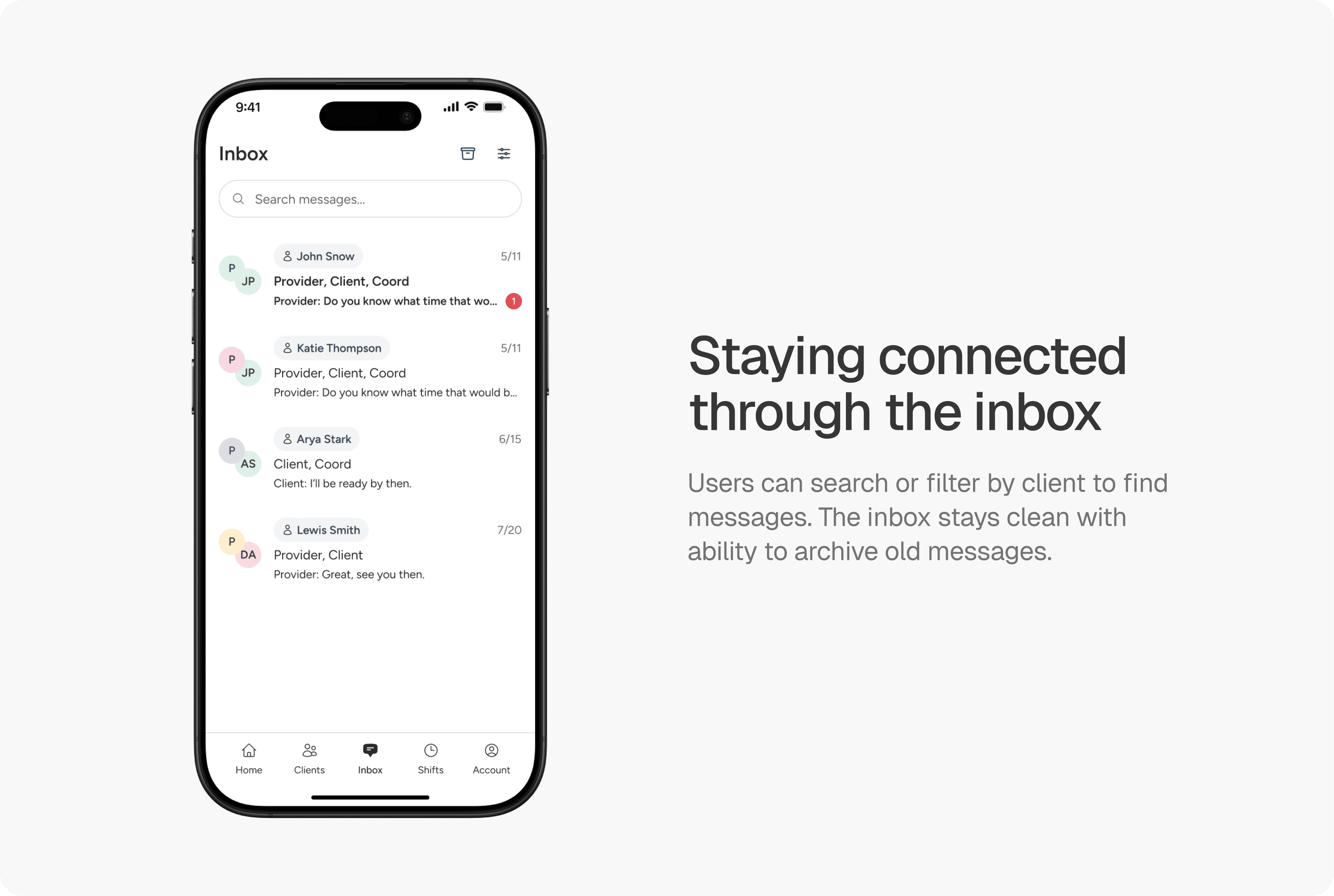
The inbox
The inbox enables providers to communicate directly with care coordinators and clients about job details, rate negotiations, and schedule updates. With filtering by client and search functionality, providers can quickly find relevant conversations without scrolling through their entire message history.
The design intentionally mirrors familiar messaging patterns—think WhatsApp or iMessage—so providers can jump in without a learning curve. In a role where time is literally money, reducing friction in communication means providers spend less time navigating the app and more time coordinating the care work itself.
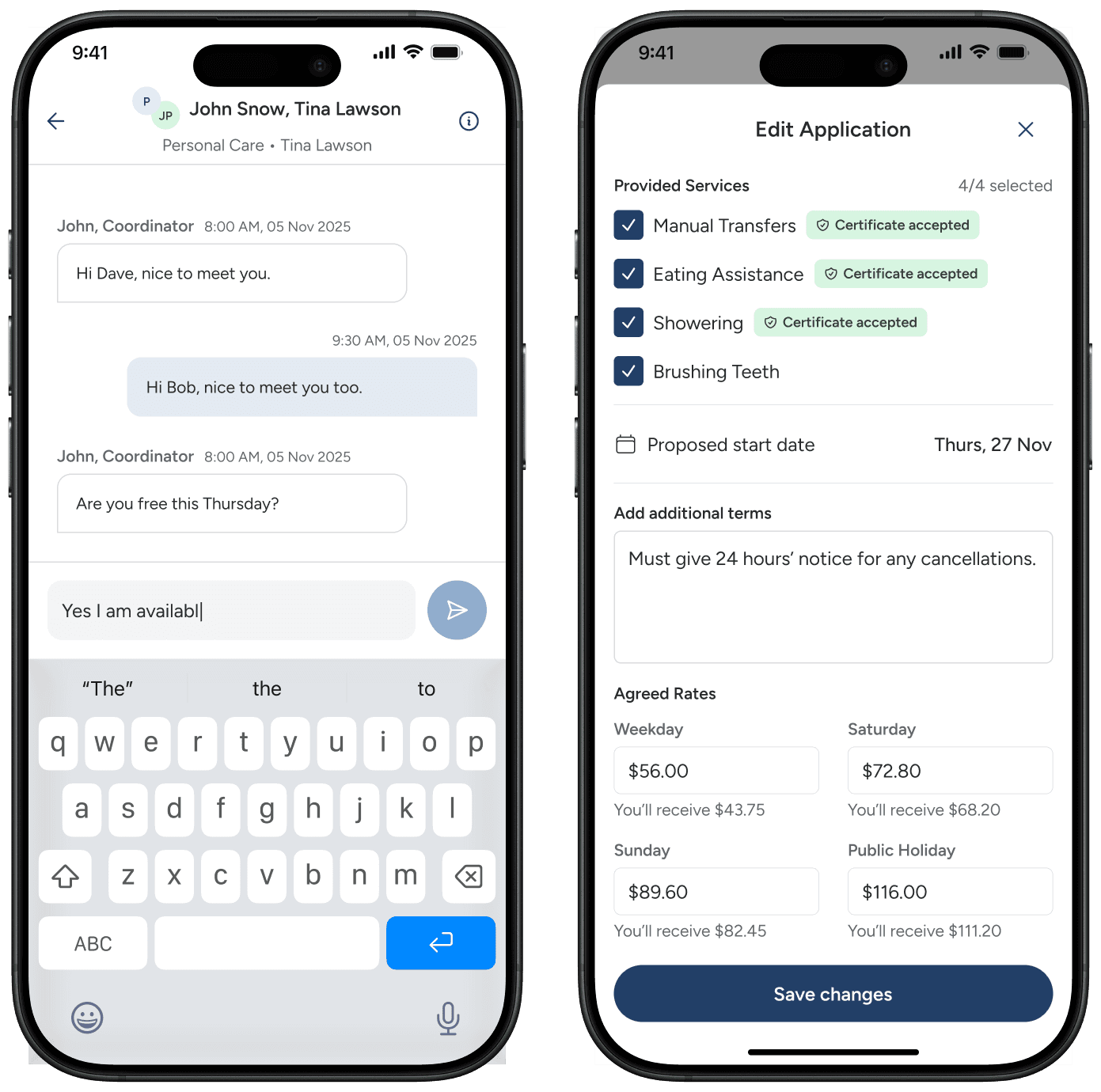
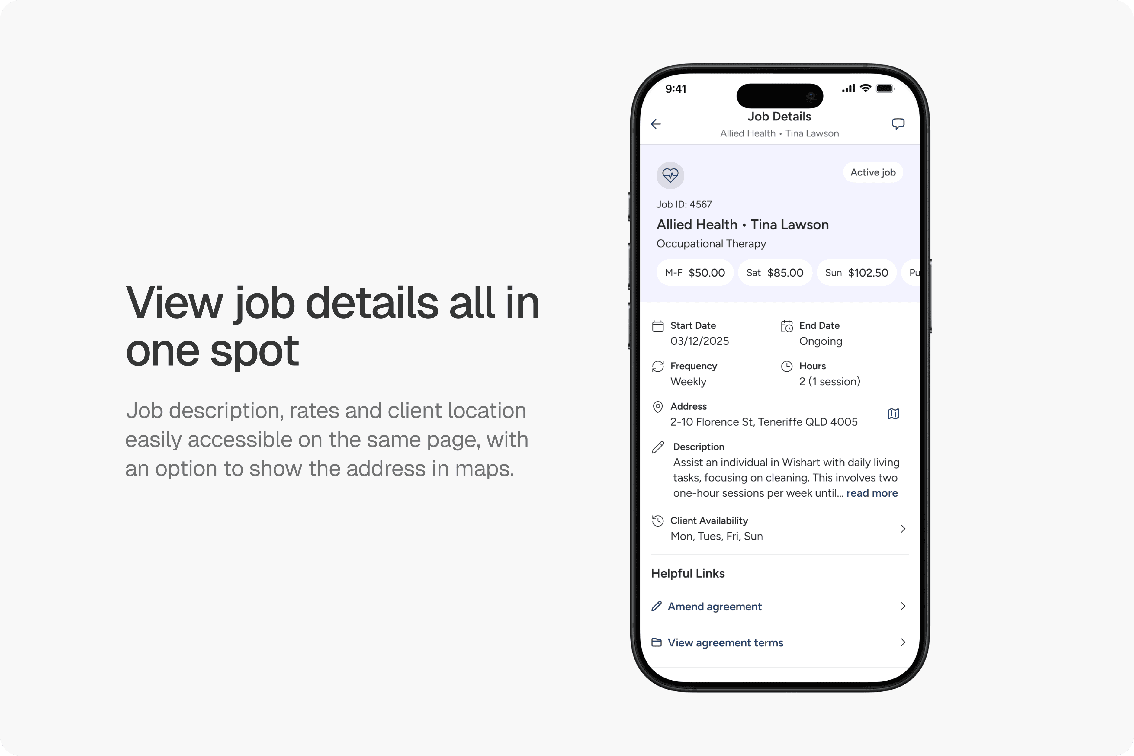
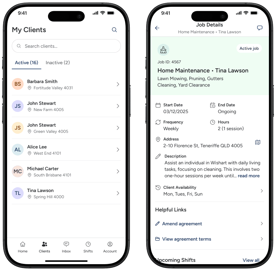
Job details
Once providers accept a job, the job details page becomes their go-to reference for everything related to that job. Client information, agreed rates, scheduling details, location, and job description live in one consolidated view, eliminating the need to dig through previous messages.
The map integration lets providers quickly check directions before heading to a shift, while links to amend agreements or review terms keep contract management accessible when circumstances change. By consolidating all job information in a single page, providers can quickly refresh their memory on client needs, confirm shift times, or find the address - especially valuable when managing multiple clients across different locations.
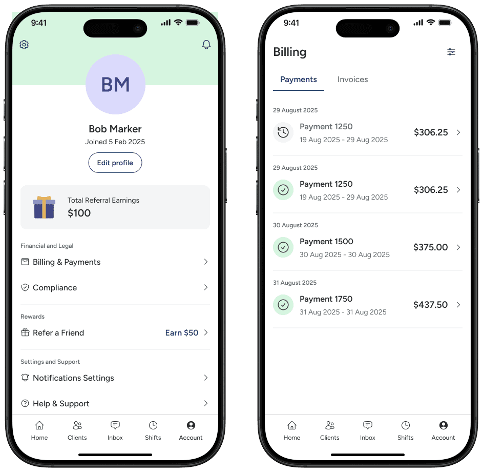
Account management
Once providers accept a job, the job details page becomes their go-to reference for everything related to that job. Client information, agreed rates, scheduling details, location, and job description live in one consolidated view, eliminating the need to dig through previous messages.
reflections
What I learned
Finishing the mobile app MVP designs within a 4 week timeframe taught me valuable lessons about design under pressure. I delivered a comprehensive feature set - shift logging, messaging, job browsing, and client management - but the aggressive timeline meant some flows were designed without the validation they needed.
The shift logging experience, which had friction on web, was able to be refined and improved. But this project highlighted a reoccurring issue in the startup world - shipping fast to learn versus taking time to get foundational experiences right. While I met the deadline and handed off designs ready for development, I've learned that protecting critical user flows, even at the cost of scope or timeline, is often the better long-term investment. The experience has made me more confident in knowing when to compromise and when to stand firm with stakeholders.