
I led end-to-end discovery and design for CareVicinity's web portal, a two-sided labour marketplace connecting support workers with elderly Australians seeking in-home care. Within months of launching the MVP we onboarded 600+ providers, and are now on track to hit our target of 5,000 active providers by mid-2026.
Role
Solo Product Designer
Team
1 Tech Lead / Acting PM
4 Software Engineers
1 Product Designer (me)
Timeframe
June 2024 - Present
Overview
An online platform provider for assisted care services
CareVicinity is a marketplace platform that connects support workers with elderly individuals and veterans who need in-home care services. The platform empowers independent contractors to build their own care businesses by allowing them to choose their clients, set their own rates, and manage their schedules while CareVicinity handles payments and administrative tasks.
The Problem
High fees and poor support
The founders of Trilogy Care, one of Australia's leading aged care funding providers, created CareVicinity to address the pain points they witnessed firsthand. Their clients were paying excessive 16% admin fees to support worker platforms that ate into their care funding, while receiving inconsistent quality of service. Meanwhile, support workers struggled with delayed payments, often waiting weeks to receive their earnings - a frustration they shared directly with the clients they served.
"As one of the leading aged care funding providers, we’re sending our clients to these support services platforms that aren’t providing a high quality of care, all while they take a massive 16% cut."
Opportunity
A gap in the market
This created an opportunity to build a labour marketplace that could address both sides of the equation - reducing costs for clients while improving conditions for support workers.
To achieve this, the platform needed to deliver:
Lower costs
Reduce admin fees from 16% to 12.5%
Quality assurance
Close monitoring to ensure consistent, high-quality care
Faster payments
Weekly payment cycles with priority processing for Trilogy Care clients
Better experience
An intuitive platform designed for both clients and support workers
Research & Discovery
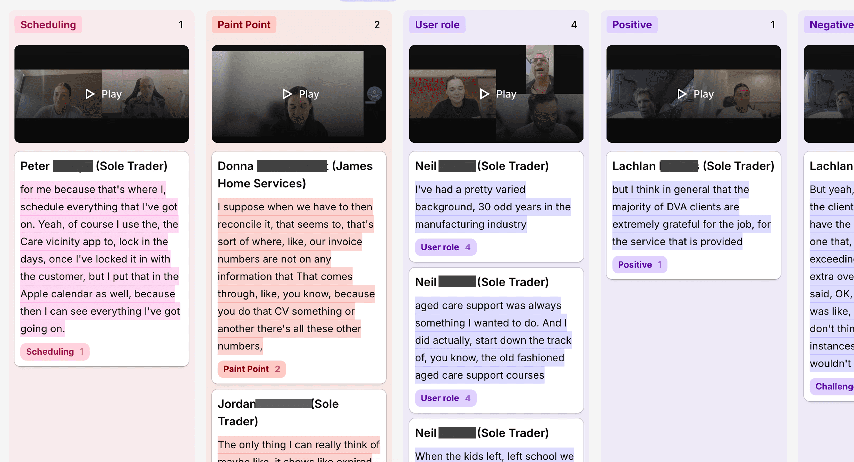
Rapid research and discovery
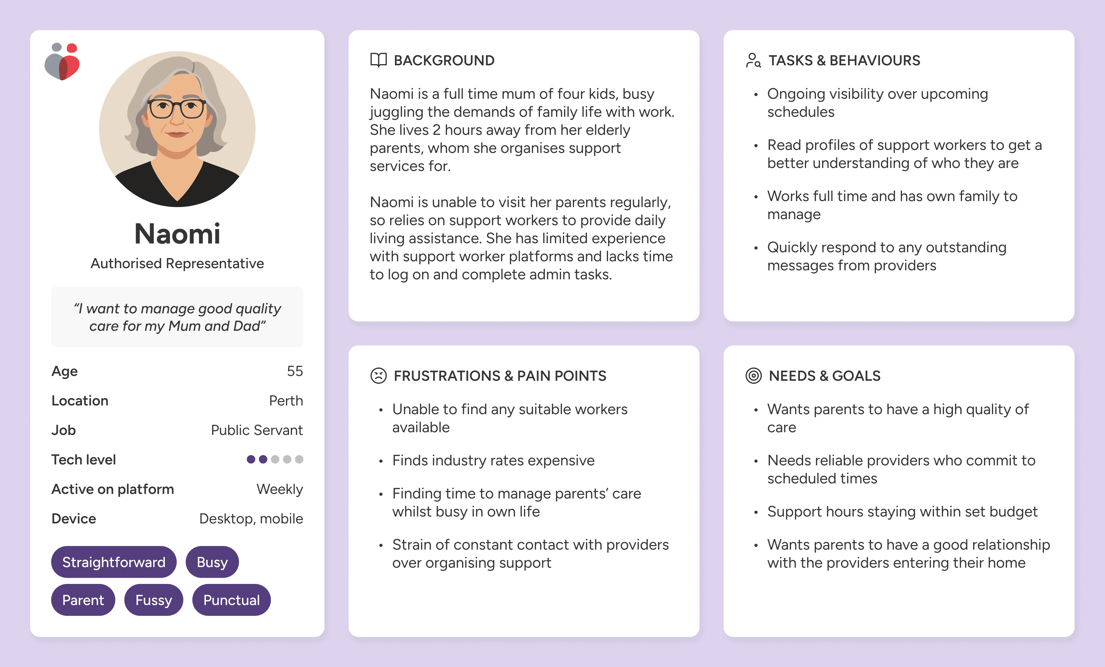
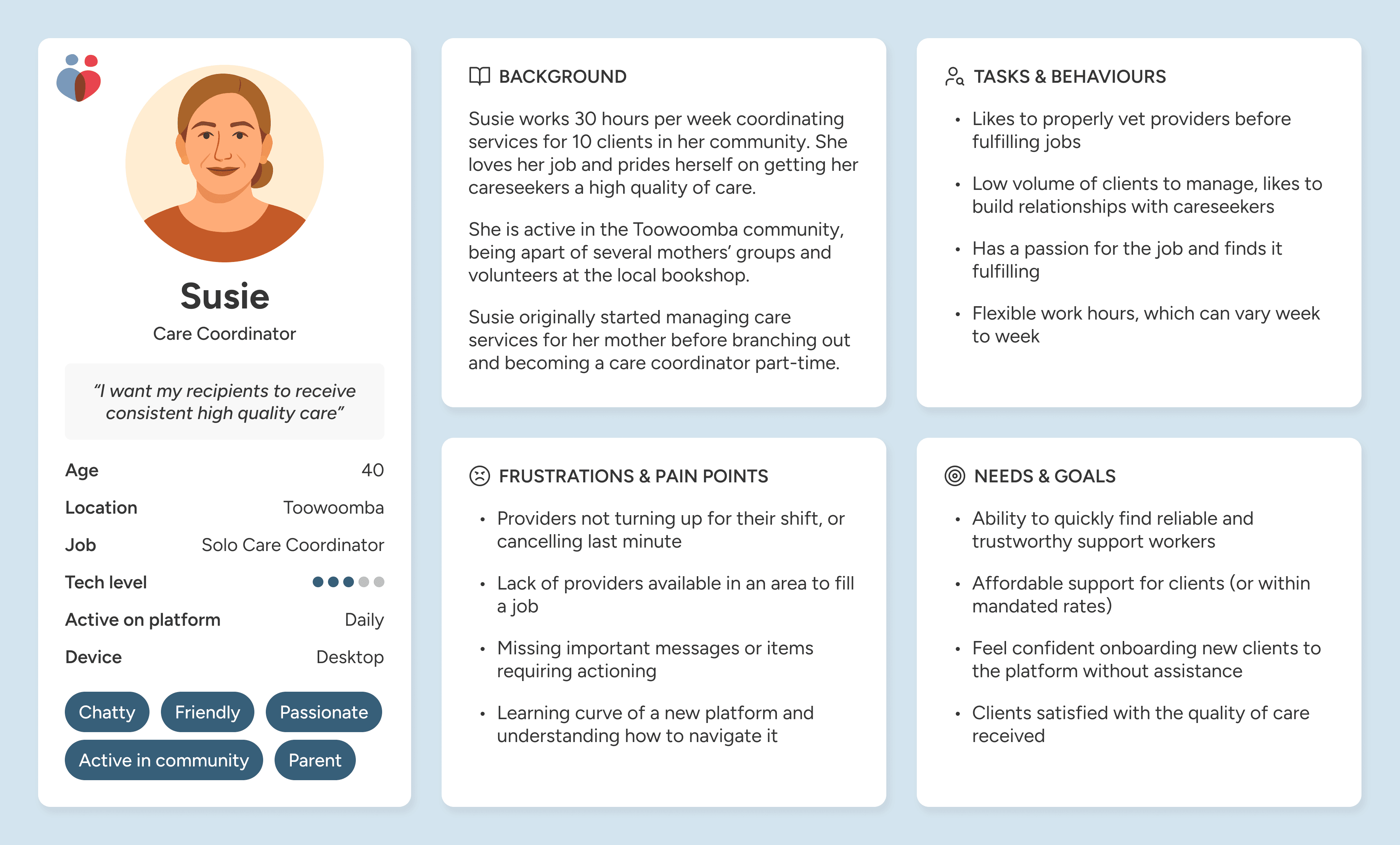
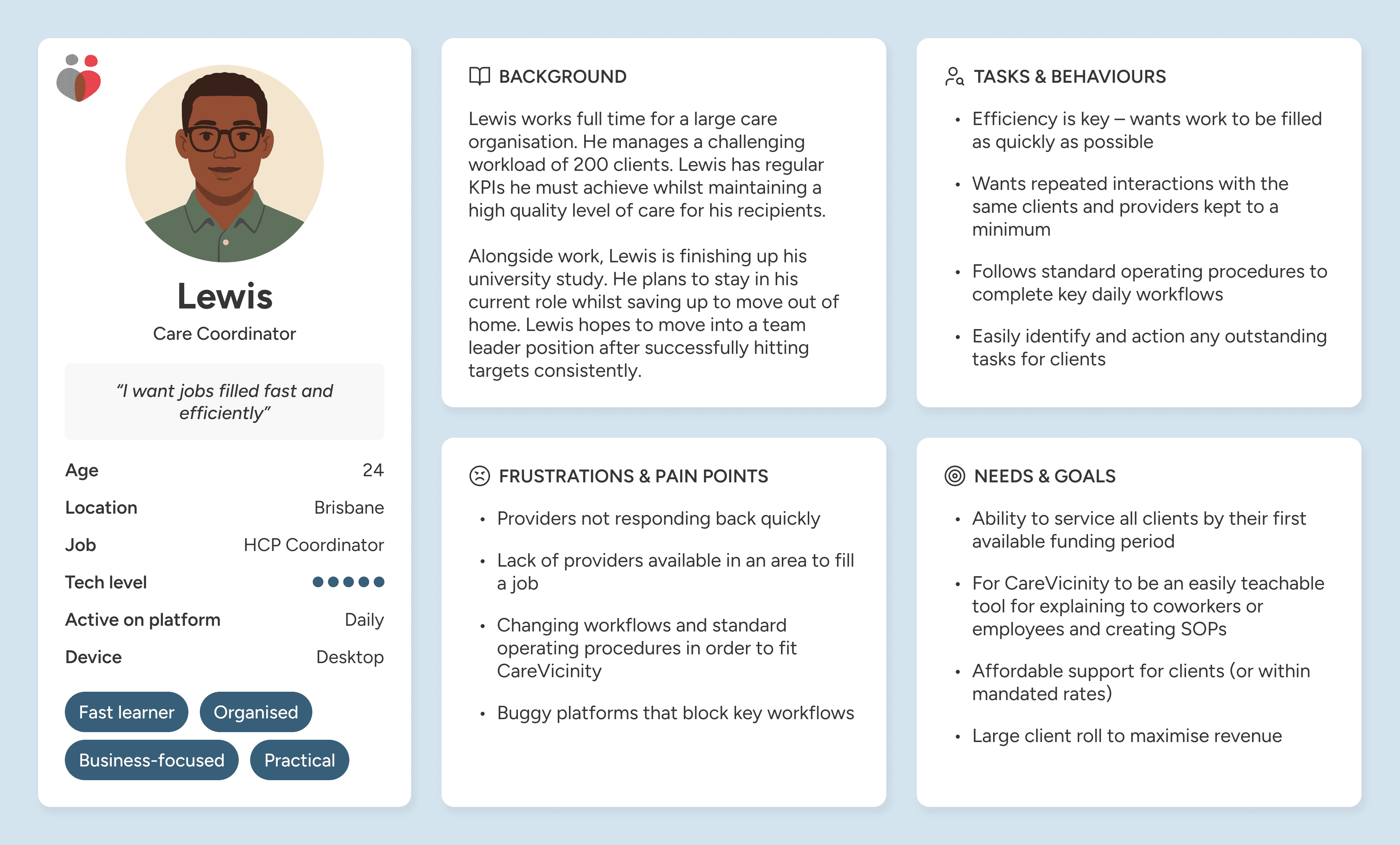
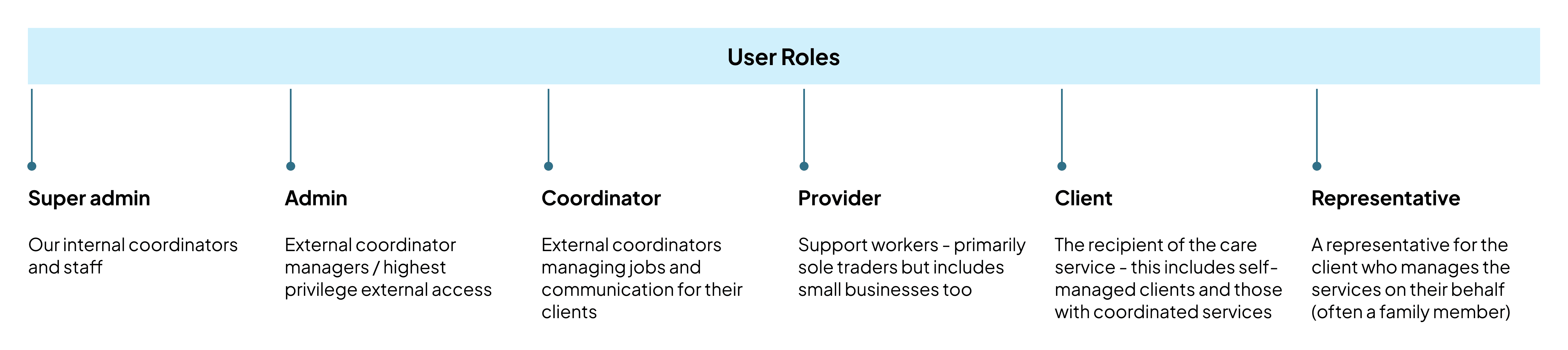
With development already underway, research and discovery ran in parallel with development. I established a consistent interview cadence with support workers - our primary beta users - conducting 2-3 sessions weekly over several months. To align the team on our target users, I facilitated a user personas workshop with senior stakeholders and customer success, defining six key user types that helped keep our rapidly moving product team focused on who we were building for.
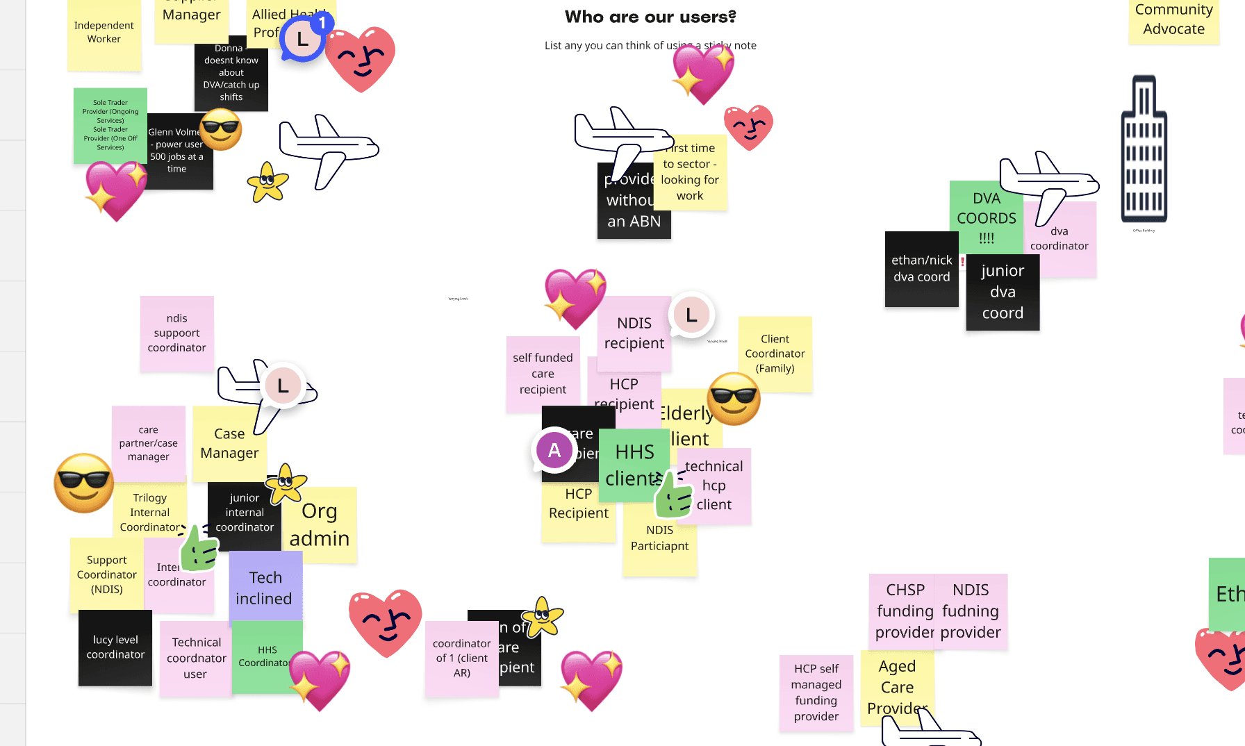
I centralised all interview recordings in Dovetail, extracting common themes and insights to share with the wider team. The research provided the evidence I needed to advocate for a tighter MVP scope, moving features like geotracking and AI job-posting to later releases when stakeholders pushed for early inclusion.
There are a few established support worker platforms in Australia, with Mable being our biggest direct competitor. I conducted a high level competitor research analysis identifying features that would help us get to feature parity. This helped to prioritise features and categorise nice-to-haves vs must-haves for the MVP.
Design Decisions
Moving fast while locking in scope
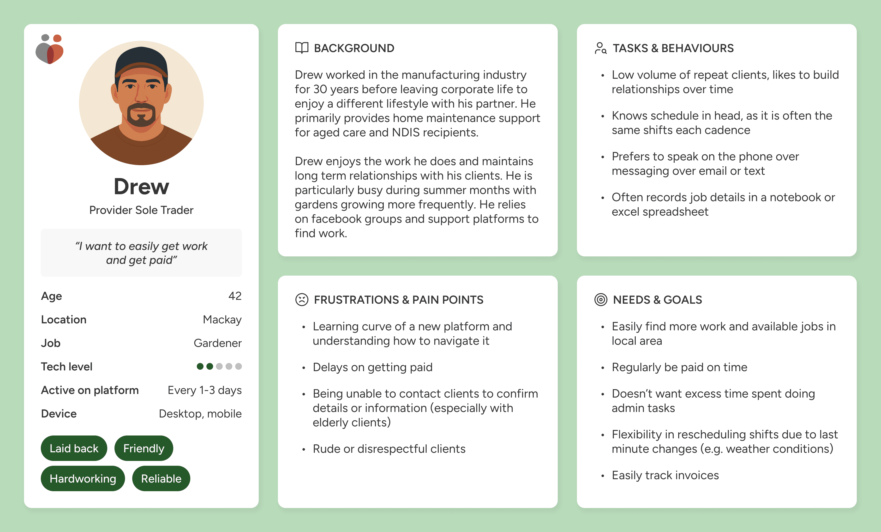
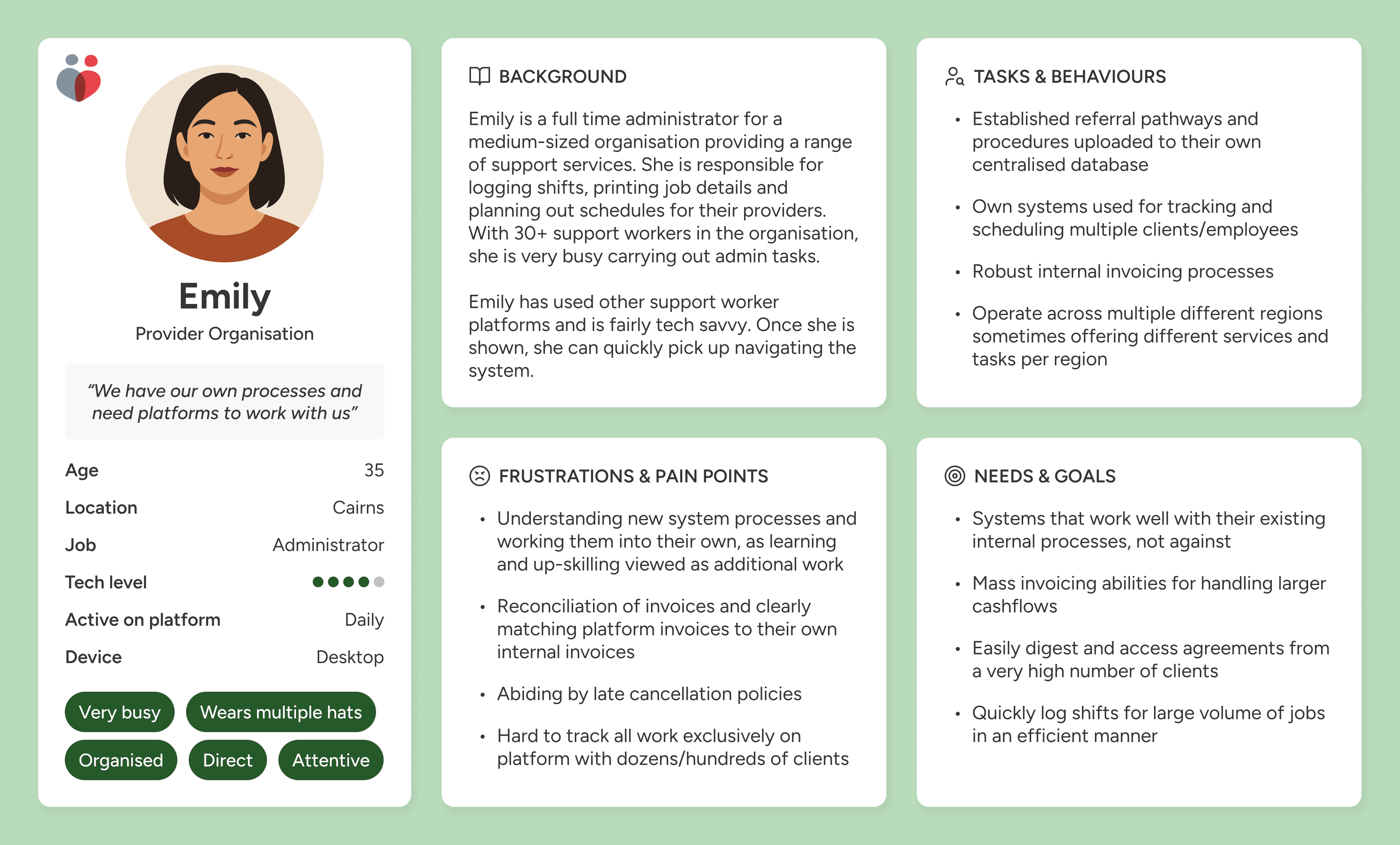
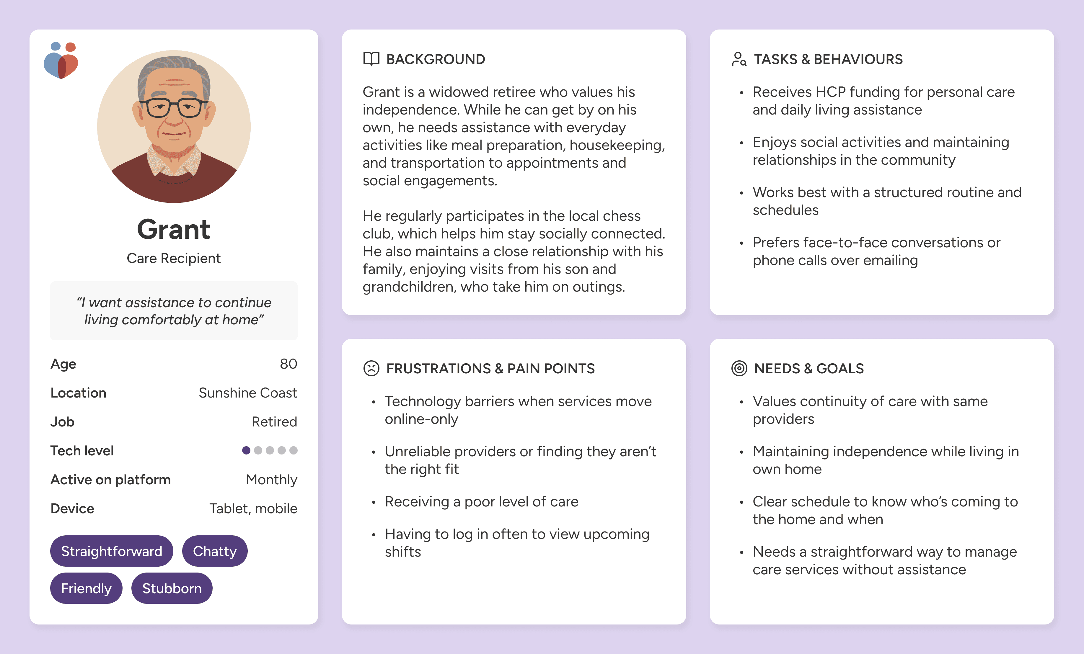
The platform would ultimately service six different user types, each requiring a login and revised platform experience. For the first launch, we primarily tackled the provider and coordinator experiences. It's easy to think of these two sides like the Uber model. Providers are the drivers of CareVicinity, taking on jobs and choosing their schedule. Coordinators are like the customers, working on behalf of clients, to find a driver to fill the job.
Establishing a design system early in the piece was paramount. I leveraged ShadCN as the foundation for CareVicinity's design system, which worked very well for our getting our MVP up and running quickly.
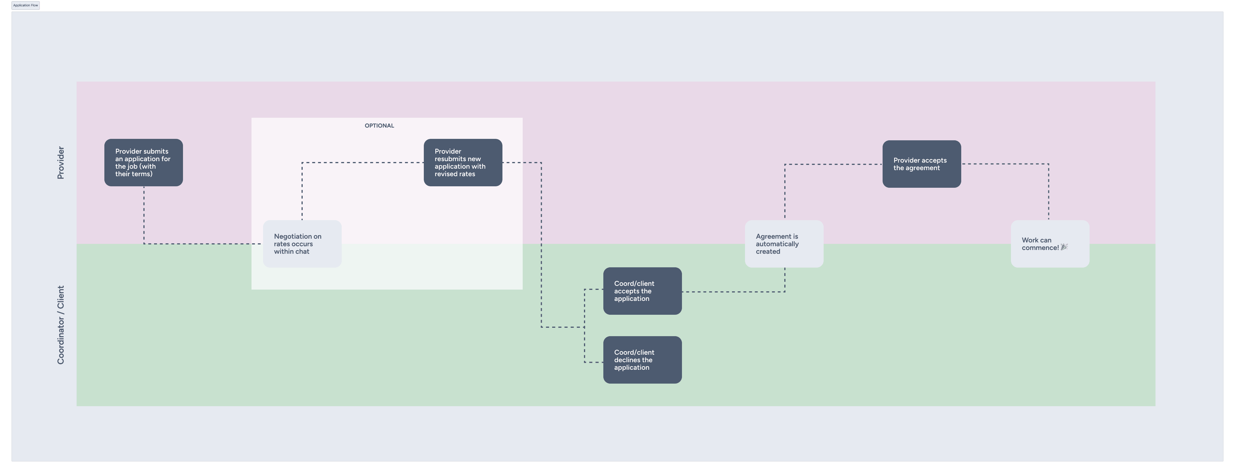
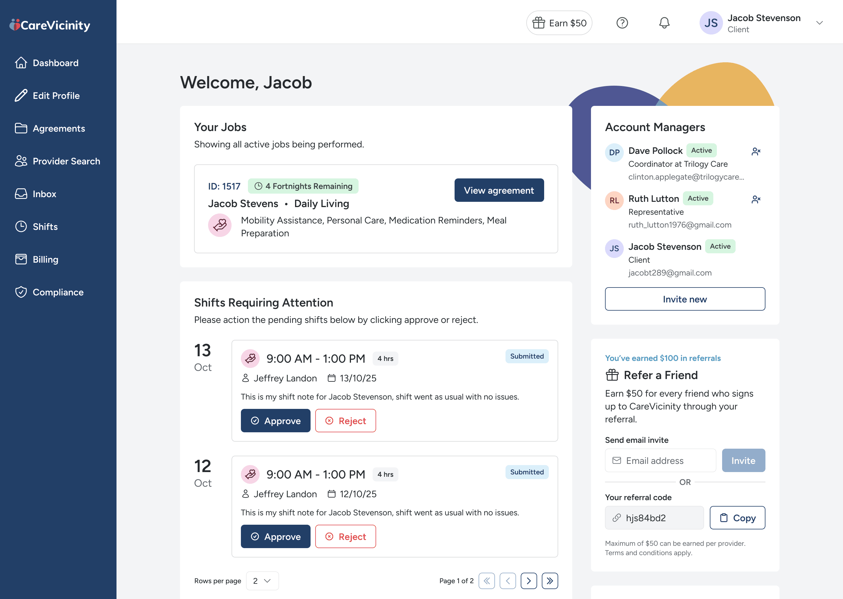
Many core flows of the platform were continuously being changed, which meant a lot of mapping out journeys and understanding how these changes impacted which user role. Below is an example for our agreement experience, which is essentially the signing of a contract between a provider and client that they agree to proceed with the working arrangement.
Initially, we wanted both the client (or coordinator acting on their behalf) to sign the agreement after the provider's work offer is accepted. But this ultimately became unmanageable for coordinators with the 100's of clients they manage - meaning after offers were accepted, coordinators would forget to come back and sign the agreement. The second step was axed, and only providers need to sign the agreement now.
As of February 2026, we have successfully launched all six user roles. This allows the CareVicinity marketplace to service a complete end-to-end care ecosystem - connecting elderly individuals and veterans seeking support with qualified support workers, while enabling care coordinators and clients to manage jobs. The platform now supports 3,600+ active support workers processing over 300 jobs weekly, creating meaningful connections between those who need care and those who provide it.

Onboarding Experience
Improving the onboarding experience
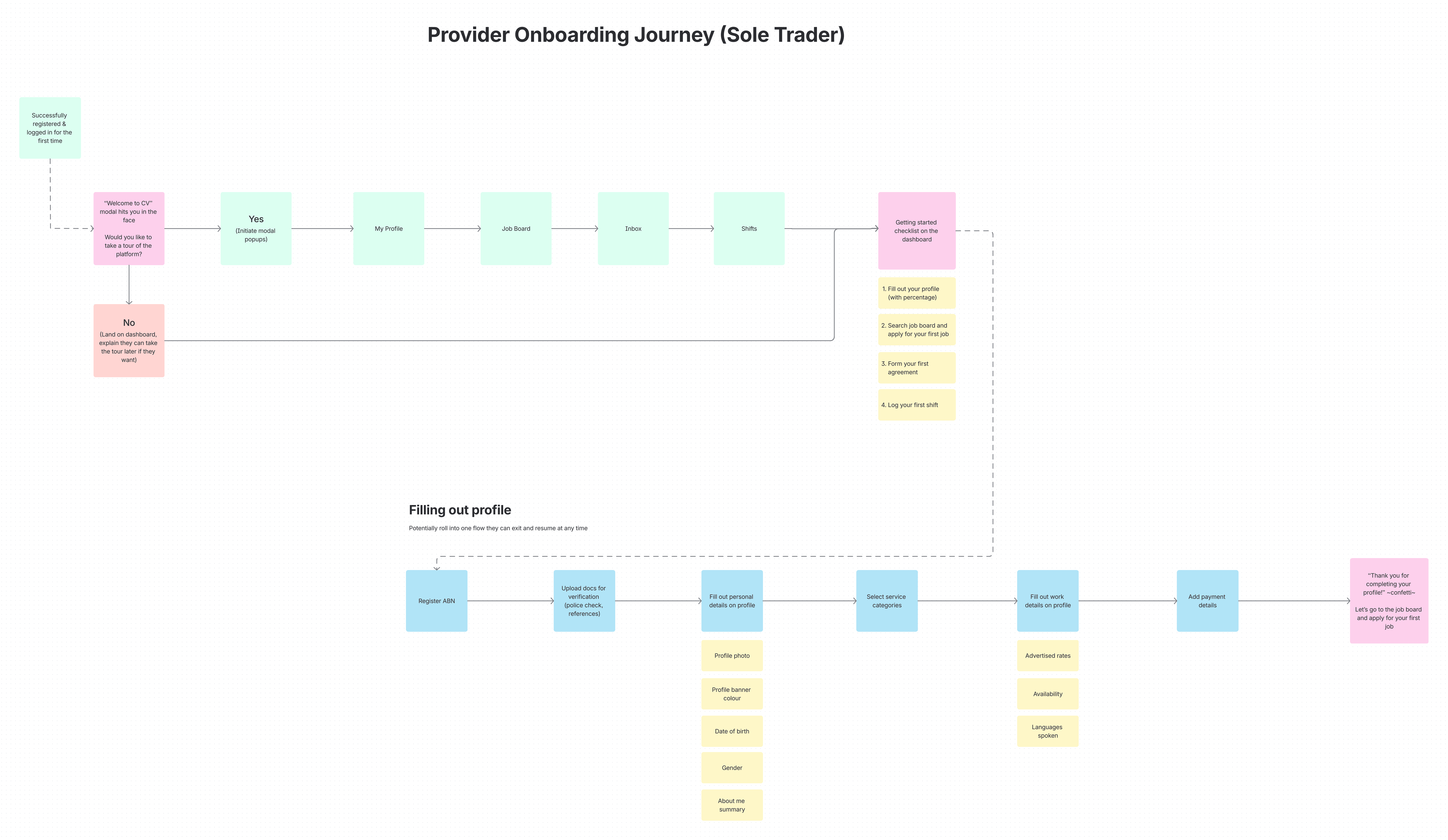
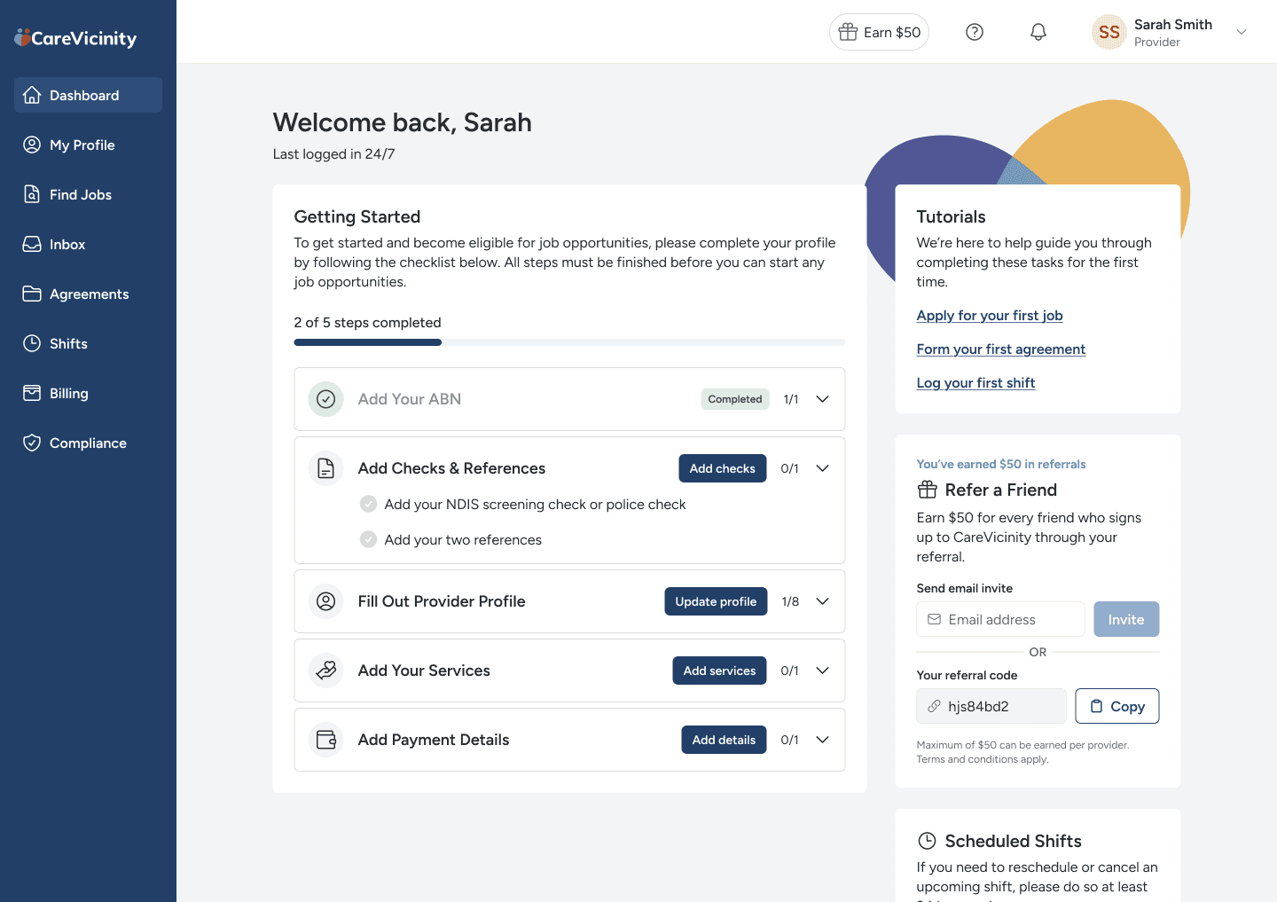
Post launch we had a steady stream of providers coming from the marketing website and Facebook groups to register. However, it became evident that many weren't making it to the verification stage. Before a provider can start taking on jobs, they must be fully verified - meaning they've provided a police check and the necessary certificates and references.
I designed a product tour that guides the user through the onboarding experience. This along with a checklist on their dashboard, increased the number of verified providers by 22%.
reflections
What went well, what went wrong and what I learnt
The platform has gained strong traction with both providers and clients. We now have a self-sufficient cohort posting 300 to 400 jobs per week without assistance - validating that the core marketplace experience works.
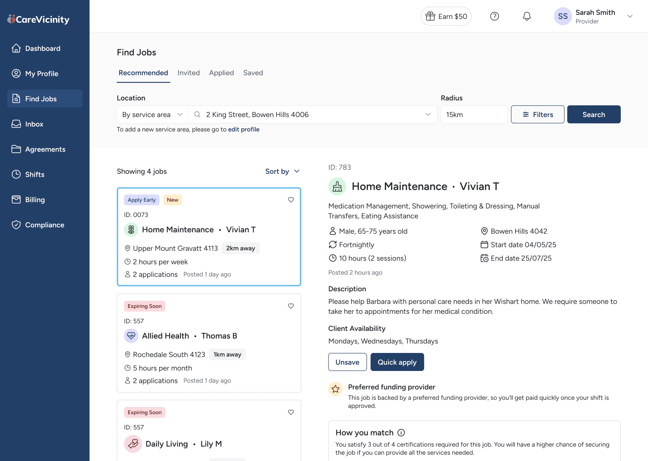
The roadmap to MVP launch was turbulent. Time constraints forced us to ship features without proper validation, and some bets didn't pay off. The biggest misstep was our shift logging modal. Providers struggled to understand how to log shifts against specific jobs, and as we added functionality, the interface became increasingly complex - a confusing list of drop-downs and fields that turned a critical task into a frustration point. I'm still advocating for a complete redesign of this flow.
Joining a startup as the solo designer with no established processes or documented roadmap was both challenging and formative. I learned to navigate stakeholder dynamics at a higher level, understanding when to push back on decisions and when to move forward despite uncertainty. The experience reinforced that even in fast-moving environments, taking time to validate core workflows - especially critical user tasks - prevents costly rework down the line.